NEED FOR REDESIGN
Most students who commute to the University of Maryland (UMD) at College Park use the app 'NextBus' to check the arrival time of university shuttles. The application serves a great purpose. It has made public transportation more accessible since people can see the exact arrival time of buses. However, for an application that is so widely used by thousands of students at UMD and millions of people in many parts of the country, it has an interface that is shockingly lacking!
USER RESEARCH AND FINDINGS
I interviewed 15 students of UMD who use the NextBus android mobile application to understand its shortcomings as perceived by users.
The main insights I gathered were as follows:
12 of them said that they find it tiresome to enter the bus route and the bus stop when they have to check the arrival time of the bus.
7 of them said it takes a lot of time to get used to the application.
1 user said she downloaded the application once long ago and found it difficult to use, so she uninstalled it.
10 of them said they find it overwhelming to remember stop names, and that they don’t want to remember all the stop names.
All 15 of them did not know of the existence of the feature to add alerts. They took some time to figure out how to add an alert, and 11 of them felt deleting an alert is not intuitive.
8 of them said that they would prefer to favorite the buses they take frequently, and not the routes. Basically, they want only one favorite per bus.
6 of them said they would prefer to see walking distance to the nearest bus stop, rather than walking distance to the destination. Also, they want it to be shown in the same app, rather than opening Google maps.
Existing flow to find a bus, add favorite, add alert and check walking distance:
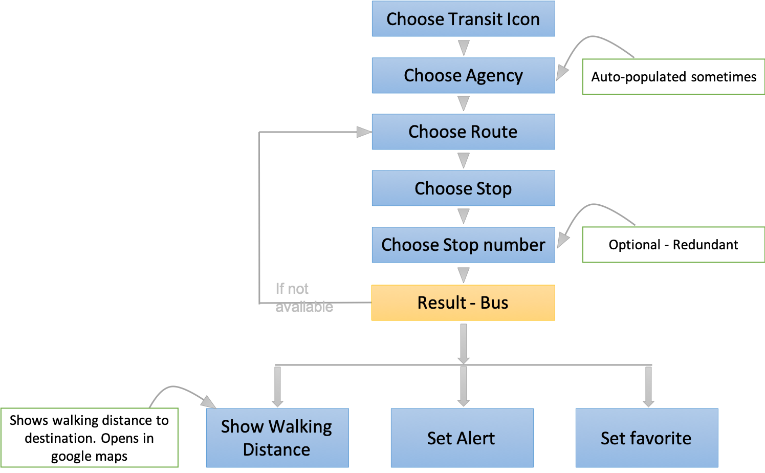
Major pain points:
1. Four mandatory input fields are required to be filled to track a specific bus. Although the ‘Agency’ field is auto-populated based on previous searches, the user has to choose the route, direction, stop and the stop number. The stop number field is optional; however, it is redundant in my opinion, as no one is ever aware of stop numbers of bus stops.
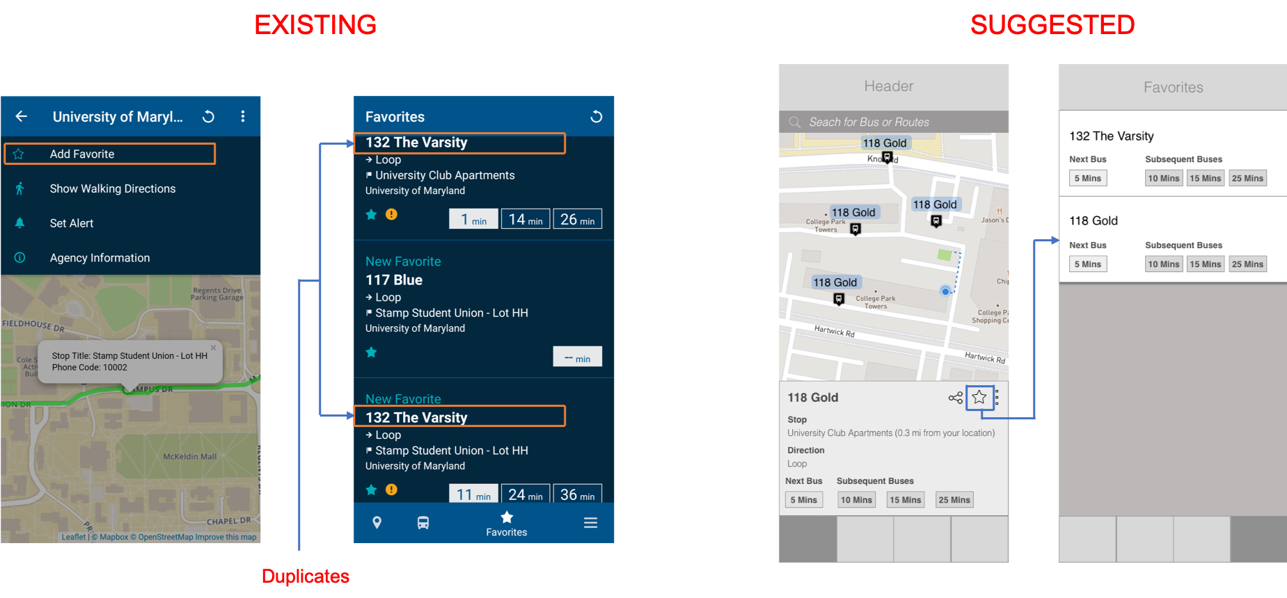
2. ‘Favorites’ feature lets the user favorite a route (the boarding stop), not a bus! This is problematic, as there is no provision to favorite a bus, which means the user has to favorite every route they take for every single bus. So there could be multiple favorites for a single bus (with different bus stops).
For example:
> Let’s say I usually board bus A to commute from home to the University.
> I board bus A sometimes from stop 1 and sometimes from stop 4
> Now, when I have to check the arrival time of bus A using the favorites feature when I’m at stop 1, I should have favorited bus A from stop 1.
> Similarly, when I have to check the arrival time of bus A using the favorites feature when I’m at stop 4, I should have favorited bus A from stop 4.
3. Under alerts, there is no provision to add an alert. One has to go to a particular route and add an alert there.
4. Remembering all stop names is overwhelming.
PROCESS
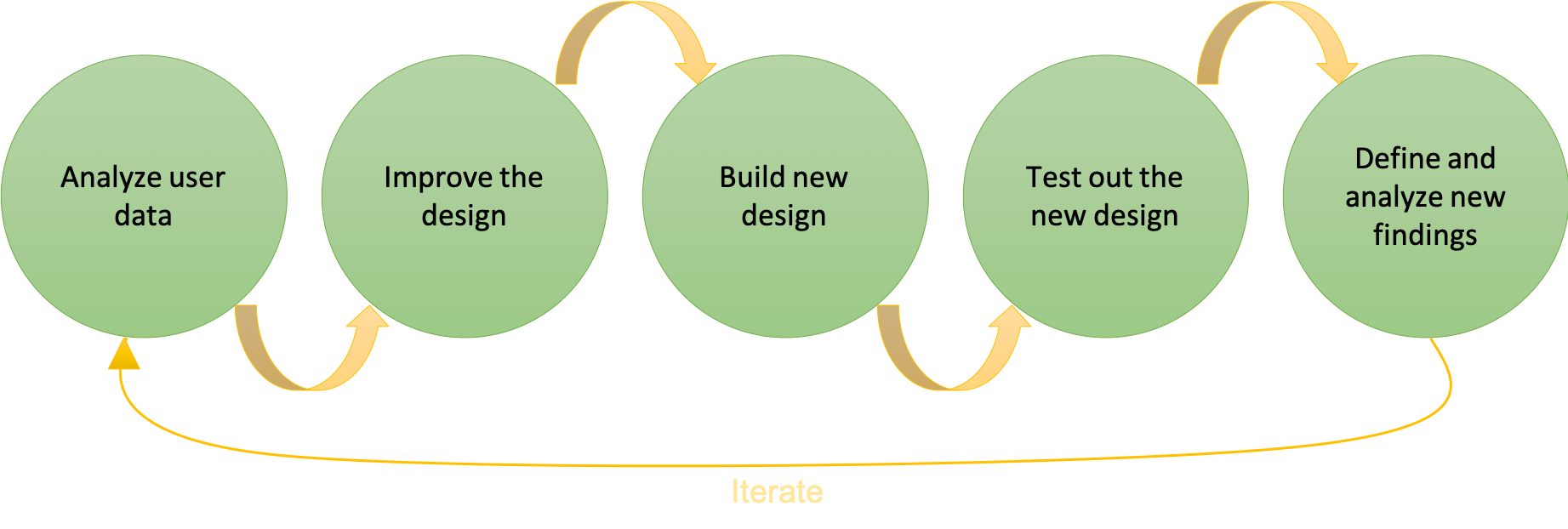
I followed the above process, where I first analyzed the user data that I obtained by interviews.
With this analysis, I brainstormed ideas to improve the existing design. I analyzed the input of the users and considered the insights that repeated the most. With this in mind, I came up new design ideas.
The new design ideas were a segue to the low-fi prototypes. I built prototypes to incorporate these design ideas in the existing application.
I tested my prototype with a different set of users (other than the users I interviewed for user research).
I observed their interaction with the prototype and noted down their feedback about what they liked and what they did not among the improved features. This helped me to understand the shortcomings of my prototype and how I can improve the design.
SUGGESTED SOLUTION
Based on the feedback I gained from the analysis and first round interview, I brainstormed how to improve the current user flow, and came up with the redesigned flow.
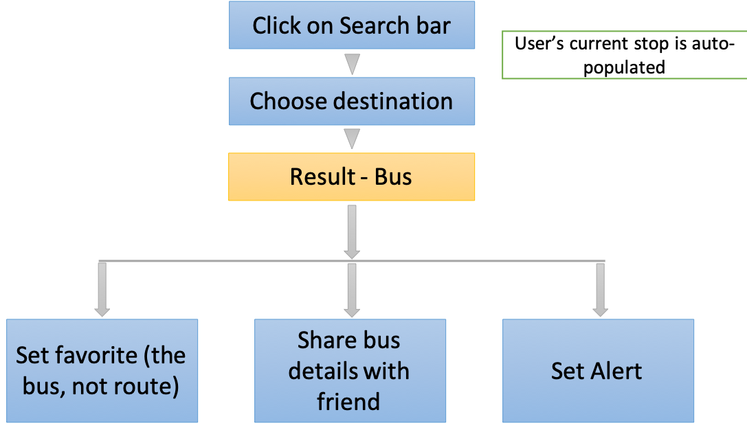
1. Simplified process of searching buses
In the current application (as mentioned earlier under pain points), four different input fields have to be filled in order to search for buses. I propose to have only two input fields: From and To. Of these fields, ‘From’ is auto-populated by GPS. Essentially, the user has to only fill one field: ‘To’. Based on these inputs, the buses that are moving that direction are displayed.
In the current application (as mentioned earlier under pain points), four different input fields have to be filled in order to search for buses. I propose to have only two input fields: From and To. Of these fields, ‘From’ is auto-populated by GPS. Essentially, the user has to only fill one field: ‘To’. Based on these inputs, the buses that are moving that direction are displayed.

2. Real time tracking of nearby buses
The ‘Nearby’ feature displays buses that are in the vicinity of the user. This information is displayed as tiles and the user has to click on the tile if she wishes to see the exact location of the bus. In the suggested solution, I propose that the Nearby screen displays the nearby buses as a map view, with Google maps integration. Each bus icon has the bus number displayed on it.
Also, clicking on the bus displays information like arrival time.
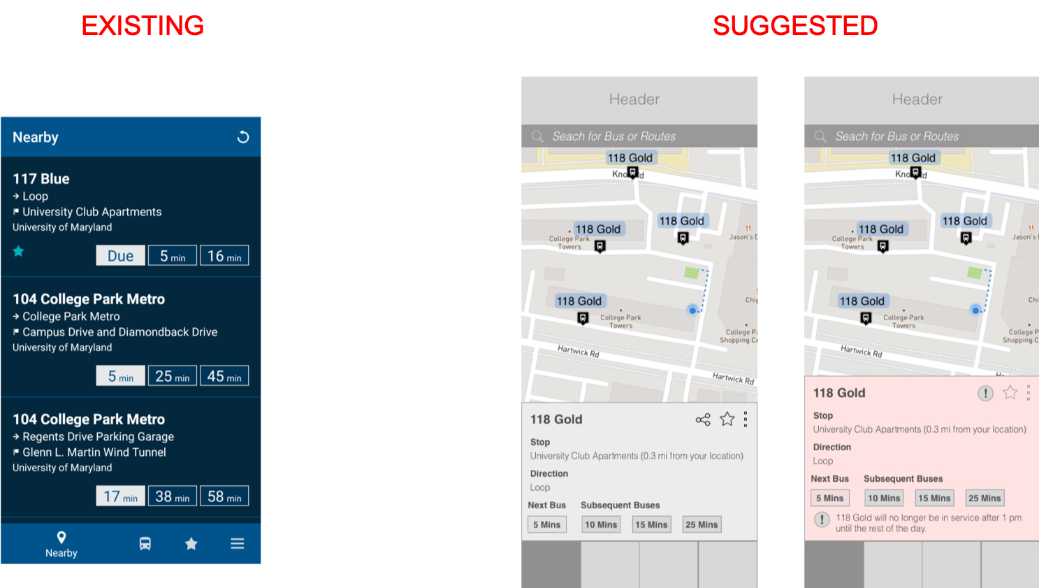
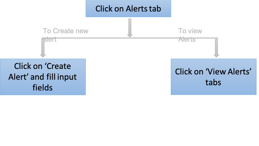
3. Intuitive process of adding alerts
Previously, there was no provision to add alerts in this screen. Alerts could be added only on clicking the desired bus.
I have added two tabs under the ‘Alerts’ feature: ‘Create Alert’ and ‘View Alert’. New alerts can be added under the ‘Create Alert’ tab.
I have added two tabs under the ‘Alerts’ feature: ‘Create Alert’ and ‘View Alert’. New alerts can be added under the ‘Create Alert’ tab.

4. Logical means of displaying favorites
I modified the favorites feature to favorite a specific bus and not a route. So, any bus will only appear under favorites only once.
5. Walking distance to the nearest bus stop
The existing ‘Show walking distance’ feature shows the distance from the user’s location to the destination, and also for this Google maps opens as a separate app. This is not a useful feature as per the users I interviewed. I modified this feature to show the walking distance to the nearest bus stop, users may not always be aware of the nearest bus stop.
The walking distance to bus stop is shown when a user clicks on the desired bus.

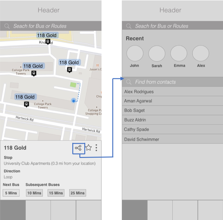
6. Additional feature: Share bus details with friends
More often than not when I’m running late, I share the bus location with my friends in order to let them know that the bus is arriving. I believe it would be a lot simpler to share the location directly rather than exiting the application and opening a messenger application like WhatsApp. So I included this feature in the redesign, where the user can share the location of bus with their friends.
TESTING
I wanted to run a small experiment to see if my solution works well. I tested the wireframes with 10 users to understand if the flow is intuitive and more user-friendly than the existing application. Otherwise, the whole point of redesigning the application is lost!
I gave a set of tasks to be performed for each user and observed with what ease they could complete the tasks, and where they found difficulty.
I gave a set of tasks to be performed for each user and observed with what ease they could complete the tasks, and where they found difficulty.
The tasks were:
1. Search for a particular bus and check its arrival time
2. Favorite the bus – 118
3. Create an alert for 117
4. Check buses near you and check walking distance to the bus stop.
The users were able to accomplish the tasks fairly simply without any hassles. Nevertheless, this only proves that the process is not unnecessarily complicated, and more usable than the existing application.
It is basically the MVP tested on very few people; so, while I do realize that there is room for improvement, this improved design helps users find desired information a lot easier than the existing process.
I also got the following feedback:
User 3 said that the alerts feature could be further modified. Currently it asks the user for the time at which they wanted to be alerted of the arrival of bus.
Instead, the user prefers if the application asks how much time before the arrival of bus they have to be notified.
For example: The user wants to be notified 5 minutes before the bus 117 arrives at the stop: University Club Apartments.
Instead, the user prefers if the application asks how much time before the arrival of bus they have to be notified.
For example: The user wants to be notified 5 minutes before the bus 117 arrives at the stop: University Club Apartments.
User 6 liked the ‘sharing’ feature, as she felt it would be convenient to share the bus location with friends. She says she is almost always late, and it takes time to exit Next Bus and open a messaging application to type a message.
All the users unanimously loved the search feature, because it means that they don’t have to remember all the bus stop names (like 'Guilford Drive and Rowalt Drive', 'Lakeside Drive and Westway' - to name a few). They liked the fact that they can type the destination name and the application displays buses traveling in that direction.
TAKEAWAYS
The process I followed for this project helped me to understand the procedure to follow while redesigning an application.
I also learnt to work entirely by myself on a project – it has both pros and cons. It allowed me to explore my creative side and delve into the design ideas.
I followed Jessie Chen’s redesign work, specifically, her case study on Lyft’s redesign - https://uxdesign.cc/lyft-re-design-case-study-3df099c0ce45.
The real motto is:
If you have good reasons and understand what the usability issues are, you should go ahead and redesign a product. If you care about your users, put yourself in their shoes to understand what they need and what they actually do when using a product!
If you have good reasons and understand what the usability issues are, you should go ahead and redesign a product. If you care about your users, put yourself in their shoes to understand what they need and what they actually do when using a product!