INTRODUCTION
Client: Visit Harford County (https://visitharford.com/) - Tourism department of Harford County, MD federal Government.
Duration: 8 weeks (Oct 12 to Dec 5)
Role: UX Researcher
PROJECT FOCUS
> To understand the expectations and behavior of tourists
> To understand how to make people use Harford County’s digital services.
> Mainly - To attract more tourists to Harford County.
KICK OFF MEETING
In the very beginning of the project, my team and I were briefed about the requirements of the client and the current pain points.
> Non-usage of the mobile platform - The Harford County tourism department has a fully functioning mobile application for both android and iOS users. Unfortunately, the mobile application is not being used as much as the website.
> Business visitors visited Harford County purely for business purposes, and did not ever venture into exploring the county. They wanted to convert this user group into potential tourists.
> The Harford County tourism fundamentally wanted to remodel their website to cater to all age groups.
> They wanted to involve local businesses in order to promote them while promoting tourism.
> Harford County is known for sports tourism - they wanted to capitalize on this to increase revenue from tourism.
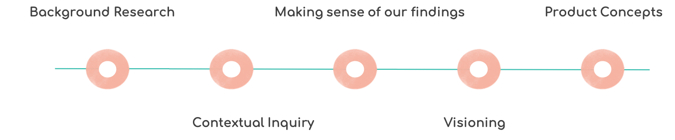
BACKGROUND RESEARCH
We started off the process by analyzing the ‘Visit Harford County’ website: (https://visitharford.com/) and the iOS and Android mobile application.
As a part of background research, we carried out a competitive analysis among the sites: PG county (https://www.princegeorgescountymd.gov/) and Visit Maryland (https://www.visitmaryland.org/) to understand the the features expected of a tourism website. The following insights are the result of the analysis:
> Both the websites have a clean and intuitive user interface.
> The websites are consistent and navigable which makes it easy for the users.
> The websites have social media integration through Instagram, Facebook, Flickr, Twitter and Youtube - This establishes a stronger connect with the target audience.
> PG County’s website dedicates a blog to the tourists, which adds a personal touch to the users’ experience.
> The websites are promoted via other popular travel websites like TripAdvisor.
The research questions that need to be answered:
How do people plan their vacation?
What do they expect out of their vacation?
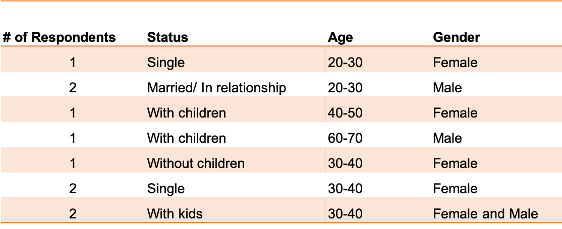
USER DEMOGRAPHIC
PROCESS
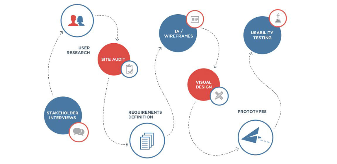
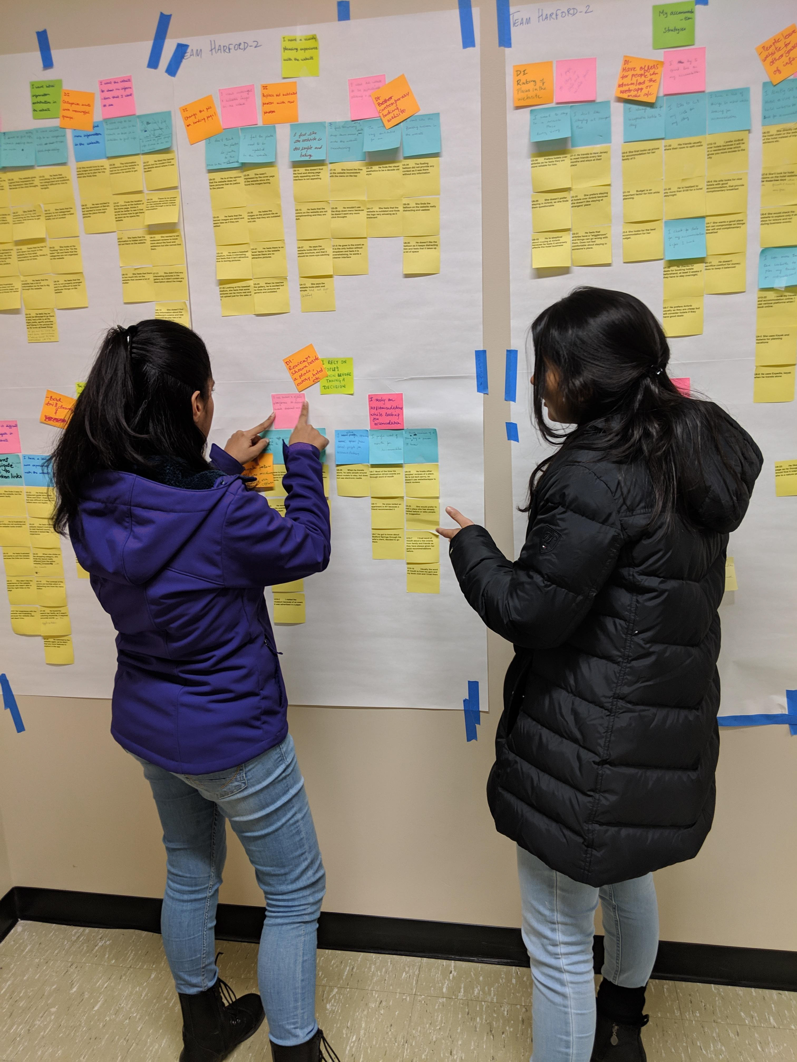
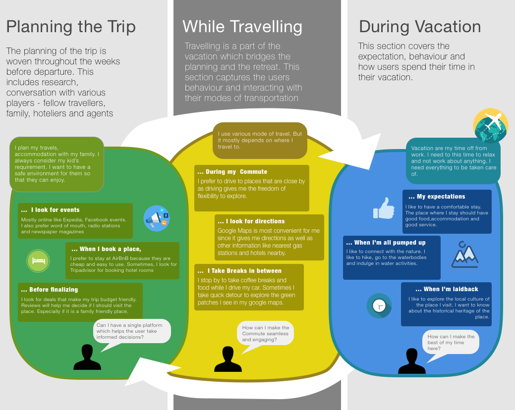
We were first introduced to the stakeholders in the kickoff meeting. The hour long interview gave us insights about what the client was expecting. That set the tone of our project. While the team was doing background research, recruitment for participants for the interviews also started parallelly. We conducted Interviews and some Contextual Interviews (CI) over a period of 10 days. We conducted Interpretation sessions after every interview. Once we interviewed 7 users, we started building the Affinity map. We added more user data as we interviewed the rest. It took a solid 2 weeks before we could see the high level emerging themes. These affinity maps told us the story our users collectively told us. We also used different models like Identity model and Decision Point model to augment our users' story.
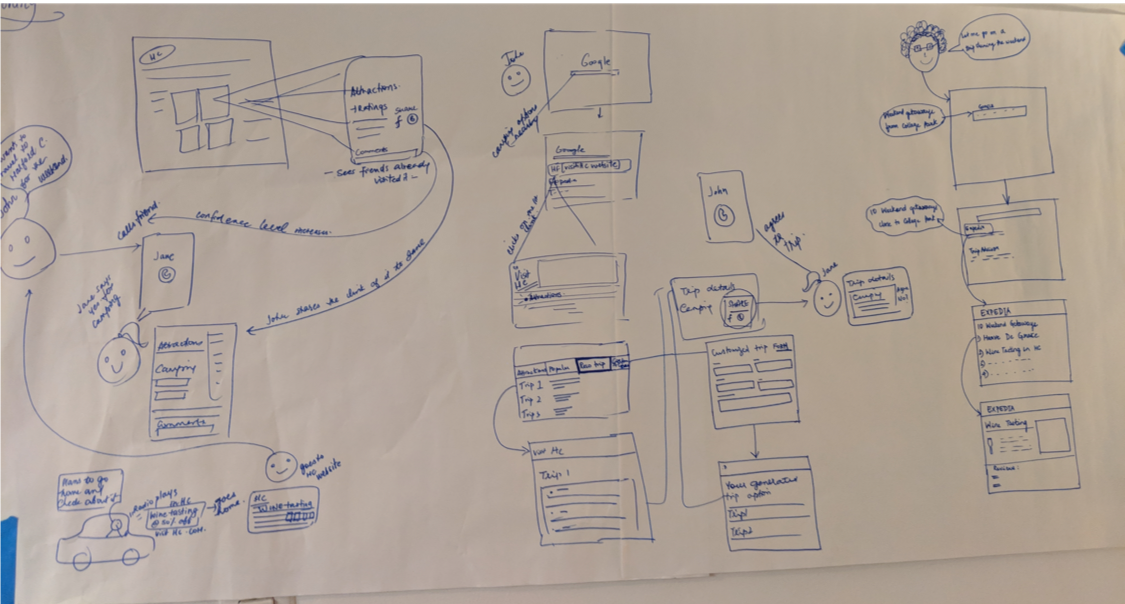
Having heard the story, we walked the wall to come up with design ideas. We followed the dot voting method to choose the best design ideas. Each of us had 4 votes to vote for our top design ideas, which helped us to narrow down to the hot ideas. This was crucial, as it gave us a sense of which ideas we want to visualize. We ran a lot scenarios to see how these ideas will fit in our users' life. After a series of storytellings, we came up with one visualization that set the foundation to our product concepts.
We customized the above process to suit out needs in the following way:
CONTEXTUAL INQUIRY (CI) and INTERVIEWS
What is CI?
Contextual inquiry is a semi-structured interview method to obtain information about the context of use, where users are first asked a set of standard questions and then observed and questioned while they work in their own environments.
My team and I conducted one-on-one interviews and Contextual Inquiry (CI) to understand the target user’s behavior, activities and discuss about the same with our participants. These one hour interviews helped us get deep insights on the our audience’s behavior patterns, expectations and experience, which were the primal insights for us to envision ourselves in our user’s shoes. As we were interviewing our 8th user, we could see a strong pattern in terms of their needs and expectation, user flows.
Interview Guide:
Our interview revolved around the following main aspects:
> Understanding the process of planning a trip
> A user's seasonal and accommodation preferences
> User's intention of using the website
> Understanding what information the user is looking for while planning a trip
> The features of the website users interact with in the website
> The steps users take while navigating through the website
> What other resources/apps/websites they use along with the county’s website to inform their trip planning decisions
> Users’ initial experience with the website
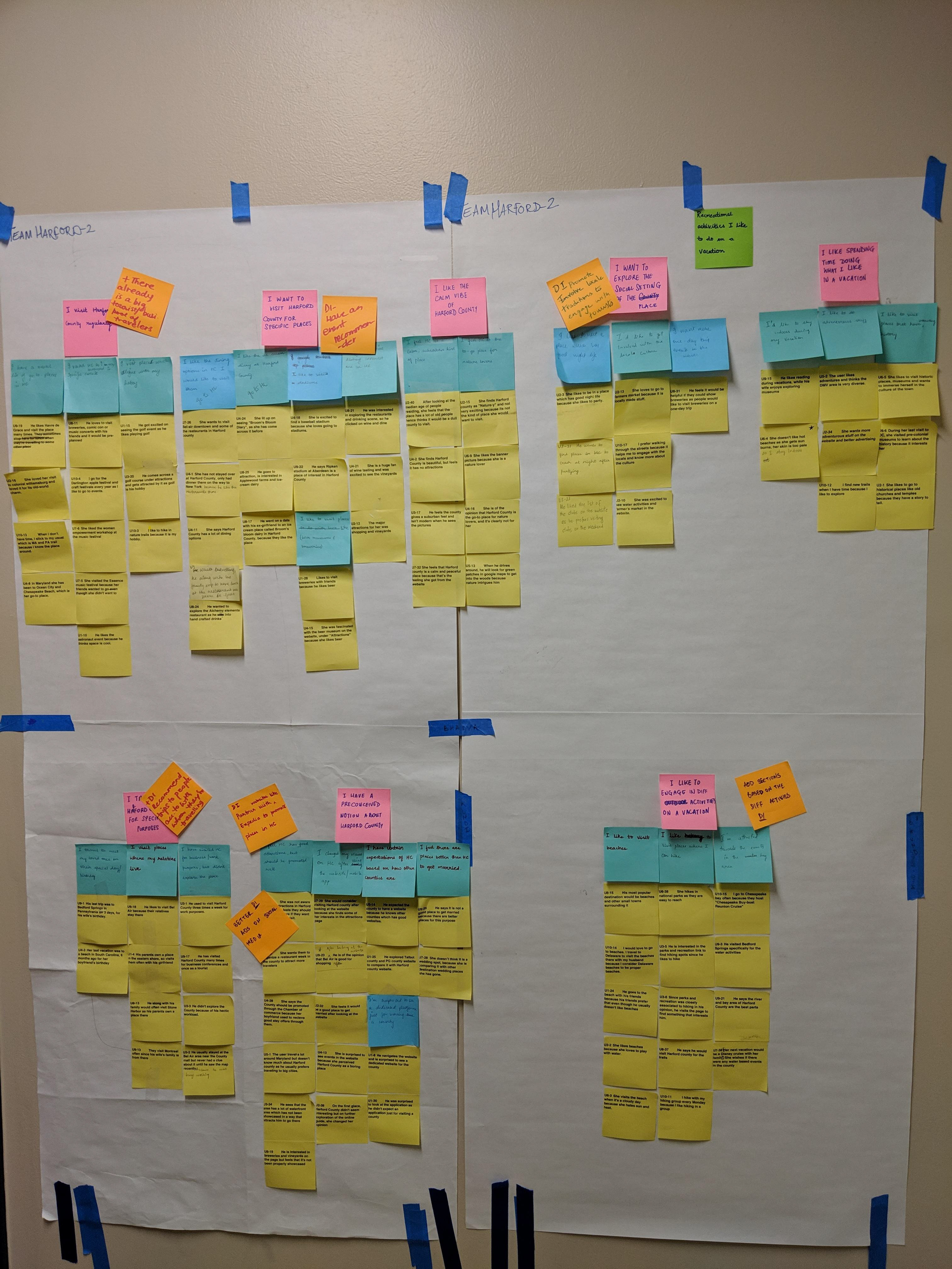
AFFINITY MAPPING
What is an Affinity map?
The Affinity Diagram is a simple method to organize large amounts of field data and organize them into groups or themes based on their relationships. The affinity process is great for grouping data gathered during research or ideas generated during brainstorms.
Process of building an affinity map:
We were first introduced to the stakeholders in the kickoff meeting. The hour-long interview gave us insights of what the client’s expectations. That set the tone of our project. While team was doing background research, recruitment for participants for the interviews also started in parallel. We conducted contextual inquiries and interviews over a period of 10 days. We conducted interpretation sessions after every interview, to make sense of the data gathered in interviews. Once we interviewed 7 users, we started building the Affinity map. We added more user data as we interviewed the rest. It took a solid 2 weeks before we could see the high-level emerging themes. These affinity maps told us the story our users collectively told us. We also used different models like Identity model and Decision Point model to augment our user’s story.
Having heard the story, we walked the wall to come up with Design Ideas. Each of us had 4 votes to vote for the design ideas. That helped us to narrow down to the hot ideas, which we wanted to ultimately visualize as product concepts. We ran lots of scenarios to see how these ideas will fit in our user’s life. After a lot of storytelling, we came up with one visualization that set the foundation to our product concepts.
Emerging themes:
Following are the green labels and some examples of the pink labels that emerged as a result of affinity mapping:
1. My planning strategies
a. I plan everything before I travel
b. I am not a person who plans beforehand
c. I plan my travels by taking cues from online platforms
a. I plan everything before I travel
b. I am not a person who plans beforehand
c. I plan my travels by taking cues from online platforms
2. My accommodation strategies
a. I prefer to stay in safe and reliable places
b. I try to spend less on accommodation
c. I use different platforms (both online and offline) to look for accommodation
a. I prefer to stay in safe and reliable places
b. I try to spend less on accommodation
c. I use different platforms (both online and offline) to look for accommodation
3. My travel strategies
a. I use Google maps for navigation
b. I travel only when it is convenient for me
c. I use different means of transport to get places
a. I use Google maps for navigation
b. I travel only when it is convenient for me
c. I use different means of transport to get places
4. The website/app was of great use to me
a. The website was very informative
b. The website seemed intuitive for me to use
a. The website was very informative
b. The website seemed intuitive for me to use
5. Recreational activities I like to do on a vacation
a. I like to explore the social setting of a place
b. I like spending time doing what I like on a vacation
c. I like to engage in various activities on a vacation
a. I like to explore the social setting of a place
b. I like spending time doing what I like on a vacation
c. I like to engage in various activities on a vacation
6. I want a visually pleasing experience with the website
a. I want meaningful and reliable images on the website
b. I want the website to be aesthetically pleasing
a. I want meaningful and reliable images on the website
b. I want the website to be aesthetically pleasing
7. I want a better information architecture in the website
a. I want to find information quickly and easily
b. I want the website to show me information I want to see
a. I want to find information quickly and easily
b. I want the website to show me information I want to see
8. I rely on people's opinions before taking a decision
a. I use both online and offline platforms to discover events around me
b. I rely on others’ recommendations while looking for accommodation
a. I use both online and offline platforms to discover events around me
b. I rely on others’ recommendations while looking for accommodation
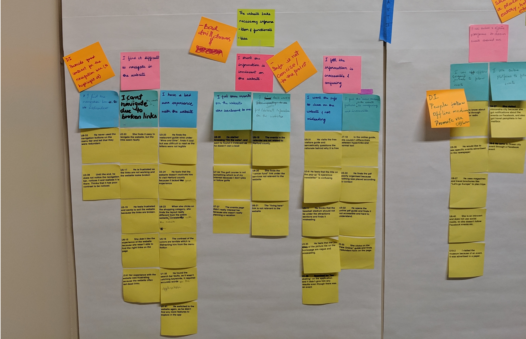
9. The website lacks necessary information and functionalities
a. I find it difficult to navigate in the website
b. I think some information is irrelevant in the website
c. I feel some information is inaccessible and confusing
a. I find it difficult to navigate in the website
b. I think some information is irrelevant in the website
c. I feel some information is inaccessible and confusing
MODELS
Models help us in visualizing data in an effective manner by representing data in a physical/pictorial form. They provide a segue from data to insights. We used the following models in our project:
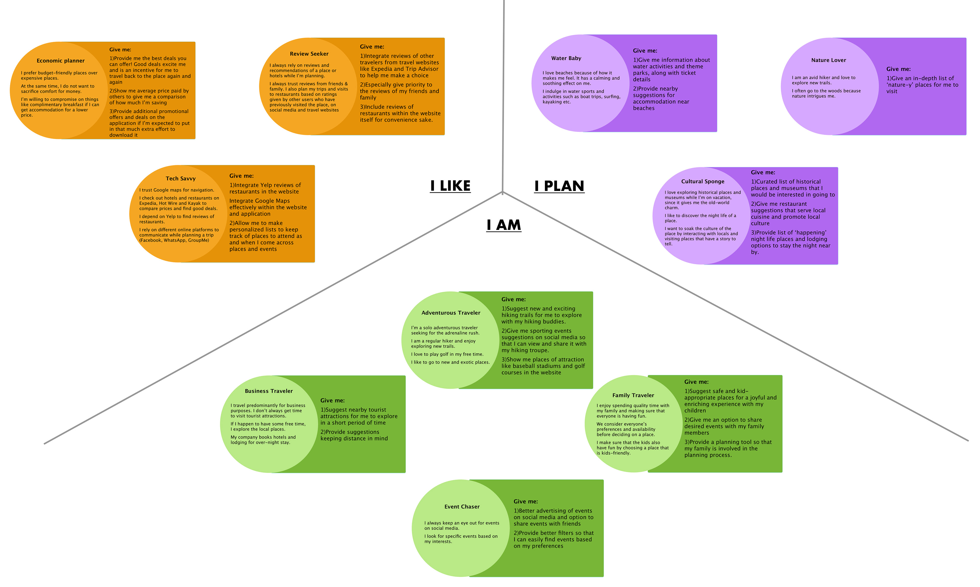
1. Identity Model:
This model reflects data relevant to Identity. It reveals the key identity elements in the target population that a product might touch. It shows sources of pride, self-esteem, and value.
Why identity model?
Why identity model?
We used this model to understand the view of the users’ world. In our case, a tourist defines success as creating the best trip for everyone in their family or friends. Our purpose is to find elements which bolster their sense of self and raise them to awareness.
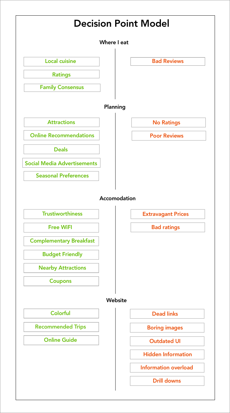
2. Decision Point Model
Decision point model will help designers to understand what influences the user to rely on a service or a product, what does not. We can leverage the mental models to design intuitive and user-friendly products.
Why decision point model?
Why decision point model?
We chose the Decision point model because we were interested in knowing what influences the behavior of our user. Decision Point model brings out exactly that clearly. These served as a checkpoint during the conceptualization process.
3. Day-in-the-life Model
The Day-in-the-life model shows how a target activity is accomplished as people move through their world; what they do in the different places; and the devices they use to get things done and access content in that place.
INSIGHTS AND FINDINGS
Contextual Inquiry and the models we built helped us let ourselves inside the user’s world. It helped us uncover some behavioral patterns. Following are our insights and top-level findings:
> 4 out of 10 people didn’t want to use up their space for an app in their phone for one time use.
> Not everyone is interested in everything. Provide them with interactive filters. Almost all users wanted better filters.
> People google everything. Have Visit Harford county on top of the search results by search engine optimization. 7 out of 10 users said they use google for all their searches.
> Reviews make or break; so, no reviews is definitely a deal breaker.
> Promoting events is as important as organizing events. Show users what’s happening in the County.
> 5 of out 10 people said they want to visit the Breweries and Vineyards.
> 7 out of 10 users said they like hiking and indulging in water activities.
> 5 out of 10 users said they like the ‘Recommended trips’ option.
WALL WALK AND VISIONING
Wall walk:
Karen Holtzblatt and Hugh Beyer explain ‘Wall walk’ in their book Contextual Design as, “The Wall Walk is managed like a visit to an art museum—each person experiences the data silently, having their own experience with it, and writing up design ideas as they go.”
It gives the team a chance to review and think about what this story means for the product they hope to design. It’s the team’s first chance to see the whole scope of data together, and consider how to respond with a coherent design solution.
After we built the affinity diagram bottom-up, we ‘walked the wall’ to read the same top-down, starting from the green label, then the pinks, and then the blues. Essentially, we started with the high-level statement of an issue and worked down to the specifics.
After we built the affinity diagram bottom-up, we ‘walked the wall’ to read the same top-down, starting from the green label, then the pinks, and then the blues. Essentially, we started with the high-level statement of an issue and worked down to the specifics.
Visioning:
Keeping in mind all the design ideas we came up with during the wall walk, we collectively went through the various scenarios that a user could encounter.
In her book, Karen Hotlzblatt says, ‘A vision is fundamentally a story of the new world you might create for your users.’
In her book, Karen Hotlzblatt says, ‘A vision is fundamentally a story of the new world you might create for your users.’
PRODUCT CONCEPTS - MID FIDELITY
The visions simply imply new product concepts. Any significant product is composed of multiple feature sets, app suites, and related services that work together to deliver value. So, as a final step of the visioning process, we identified various product concepts - the conceptual ideas that could be incorporated into the product to make it more usable.
As a result of the user research we conducted, the product concepts we came up with are:
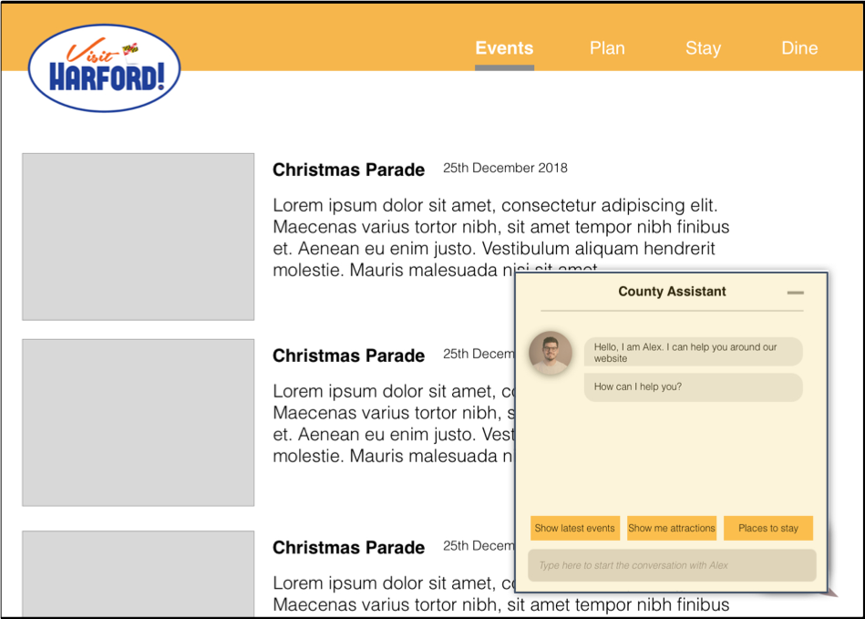
1. Introducing a Chatbot - An AI chatbot would render conversational UI, which provides a privilege of interacting with the computer on human terms.
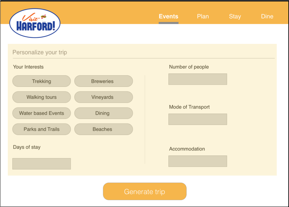
2. Personalized trip planner - A user will be asked to fill out a questionnaire to find out their interests, to devise a set of customized trips, in order to help them in the planning process.
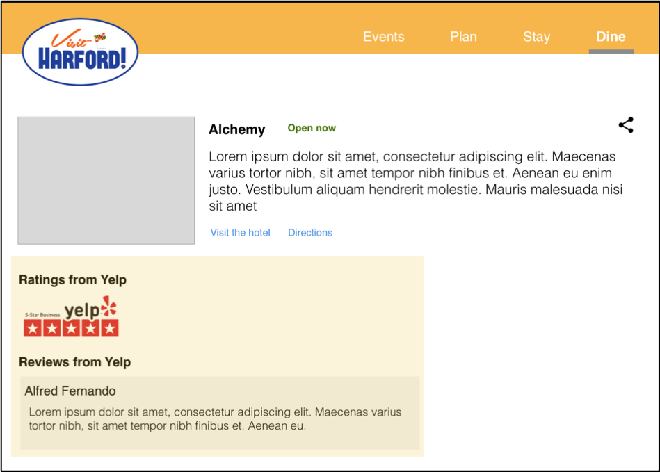
3. Display reviews of places and restaurants - Based on the results of our research, we found out that people rely heavily on ratings and reviews. Including them under each restaurant will help users make informed decisions, especially if reviews from trustworthy sources like Yelp are integrated.
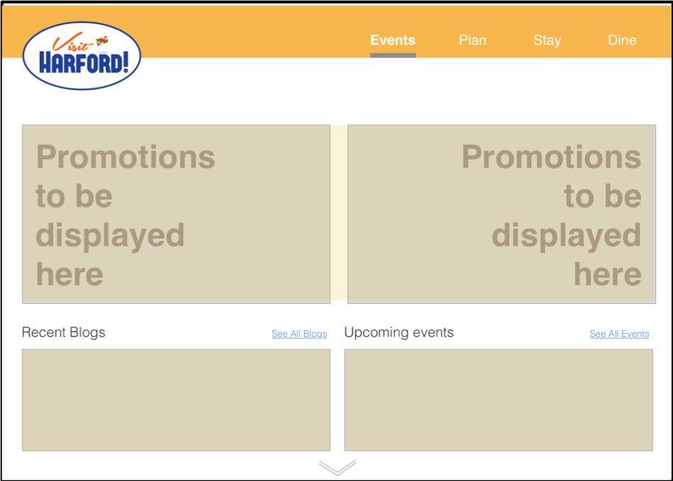
4. Better promotion of events on landing page and inclusion of blogs related to Harford County - Displaying upcoming events on the landing page will grab the attention of users and will help them to plan ahead of their trips.
Also, people believe other tourists’ opinions more than what the County has to say about themselves. Including blogs about the County with people’s real experiences will positively influence the user’s decision.
Also, people believe other tourists’ opinions more than what the County has to say about themselves. Including blogs about the County with people’s real experiences will positively influence the user’s decision.
LEARNING AND TAKEAWAYS
This project has given me the biggest learning curve so far in terms of the knowledge I gained while working on it.
> Firstly, I learnt to work as a part of a team by dividing responsibilities. It promotes collaboration and brainstorming, while improving productivity.
> This project concentrated particularly on user research using Contextual Inquiry(CI). I got to learn CI from the very basics, starting from conducting one-on-one contextual interviews, interpreting the results, making sense of the data by building models and finally inferring the results and translating them to product concepts.